


For nearly a century, St. George’s School has set the benchmark for academic excellence and character development in independent education. But as the school approached its 90th anniversary, its visual and verbal identity had become fragmented—multiple logos, an inconsistent color palette, and a lack of cohesion across touchpoints.
Persona was selected as the agency of record to lead a comprehensive rebrand, aligning St. George’s with its core values while positioning it as a leader in 21st-century education.

A school’s brand isn’t just a logo—it’s a reflection of its mission, culture, and reputation. Our process began with an in-depth brand audit, revealing inconsistencies across visual identity, messaging, and stakeholder perceptions.
Over 20 different typefaces and inconsistent colour applications had diluted the school’s identity.
A sea of disconnected crests and logos had blurred the institution’s presence.
A need for clear brand positioning to reflect St. George’s distinct approach to holistic education and leadership development.
Our goal was to distill the school’s essence into a unified, future-proof identity—one that would resonate with students, faculty, alumni, and prospective families alike.


Working with Headmaster Tom Matthews and the leadership team, we engaged students, alumni, faculty, and the broader school community to ensure the rebrand reflected both leadership’s vision and the school’s lived experience.
Through this collaborative process, we clarified core values, articulated what sets St. George’s apart in Canadian independent education, and refined a future vision that balances tradition with innovation.
The result was a unified brand strategy that honors the school’s legacy while positioning it for long-term growth and global relevance.
The updated identity system introduced a flexible, scalable brand architecture that would:
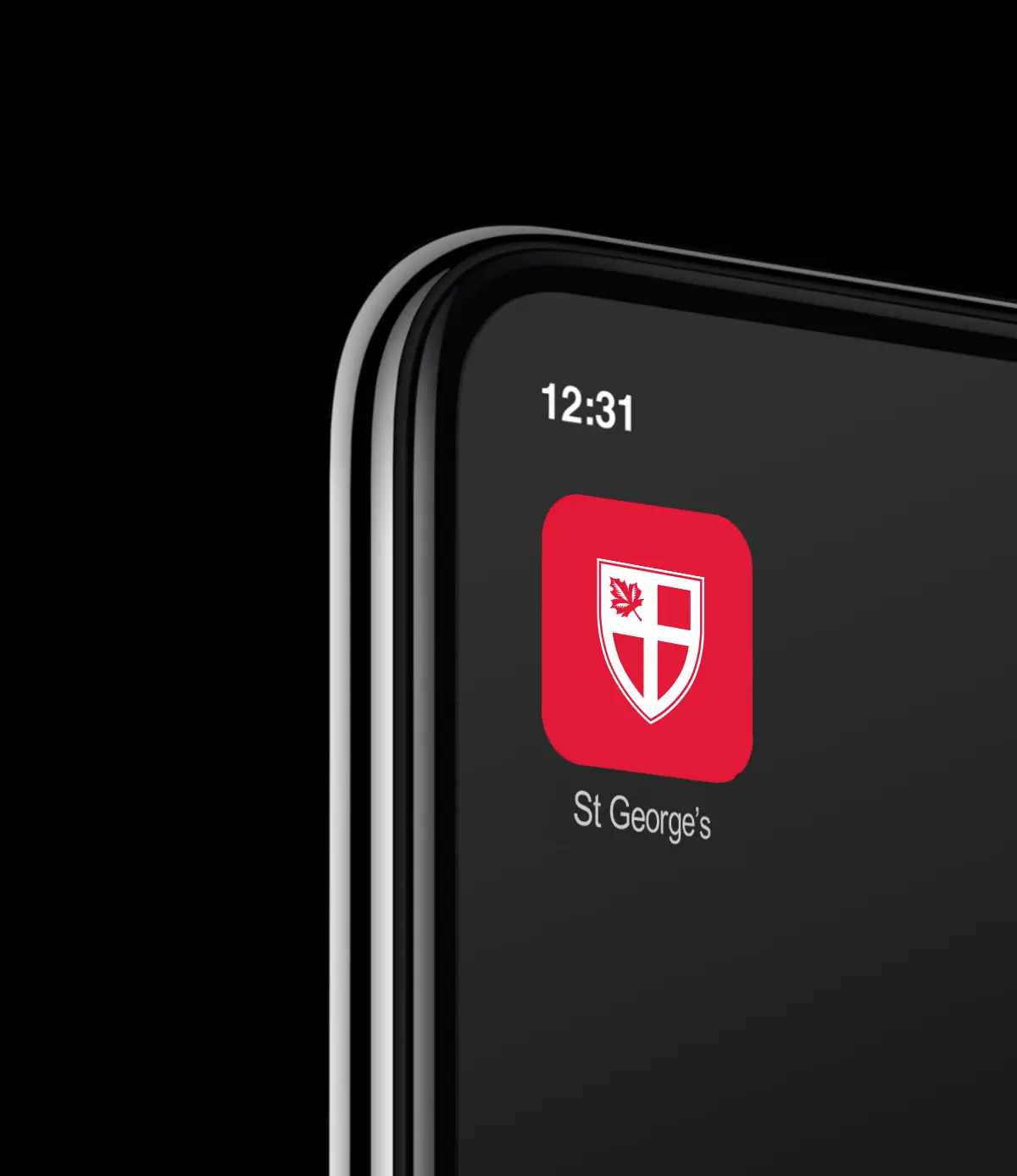
Modernize the school’s core crest while preserving its historic integrity.
Create a day-to-day logo for more versatile applications.
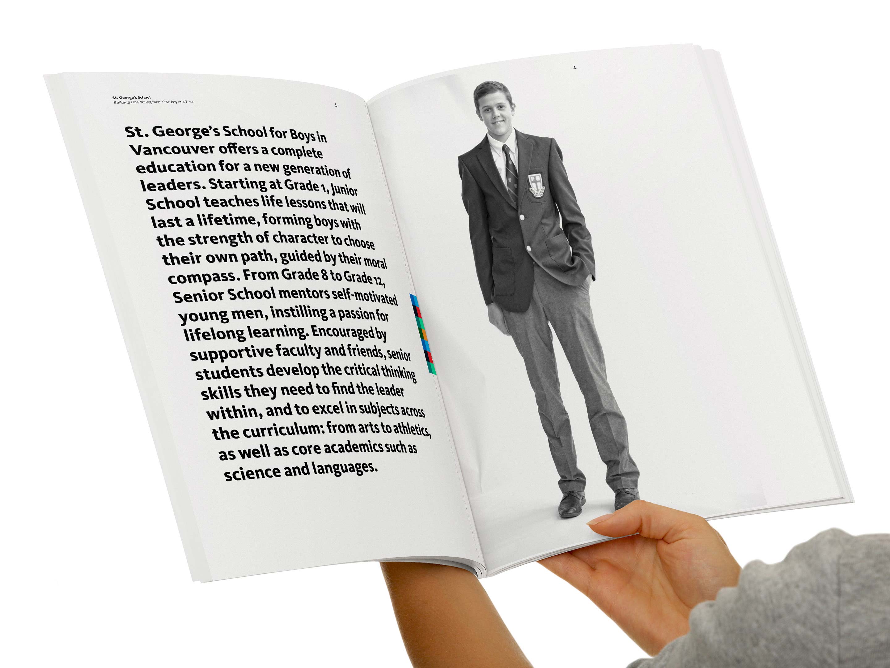
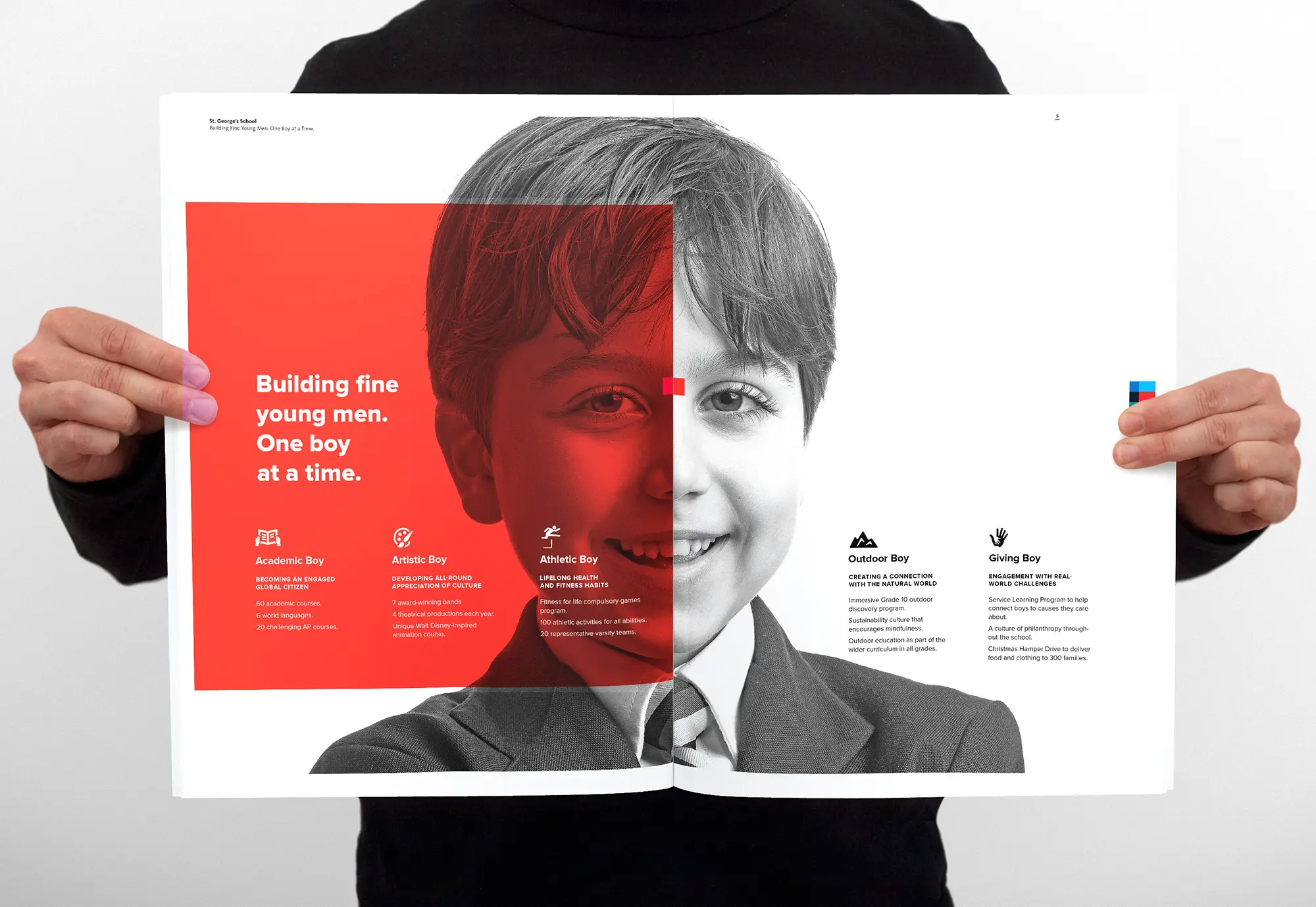
Establish a consistent typographic system and colour palette to unify all communications.
Beyond the visual identity, we developed a verbal branding strategy that strengthened the school’s messaging—ensuring that every interaction, from admissions to alumni engagement, conveyed clarity, confidence, and authenticity.


The visual evolution of St. George’s was reinforced by a verbal strategy designed to articulate what makes the school truly unique. We developed a messaging framework that captures its heritage, character, and future vision, ensuring that every communication—whether for admissions, alumni relations, or internal engagement—feels authentic and aligned.
The new identity, with its confident visual and verbal language, gives St. George’s a voice that is not only distinct but also consistent, scalable, and adaptable as the school continues to grow.


A rebrand is only successful when it resonates with the people who live and breathe the institution every day. At St. George’s, the new identity was met with enthusiasm, reinforcing a shared sense of purpose and pride.
To ensure a seamless transition, we provided the school’s communications team with a comprehensive brand toolkit, equipping them with the assets and guidelines needed to maintain consistency while allowing for adaptability. The accompanying brand governance framework serves as a roadmap for long-term implementation, covering visual identity, messaging, and art direction for photography.
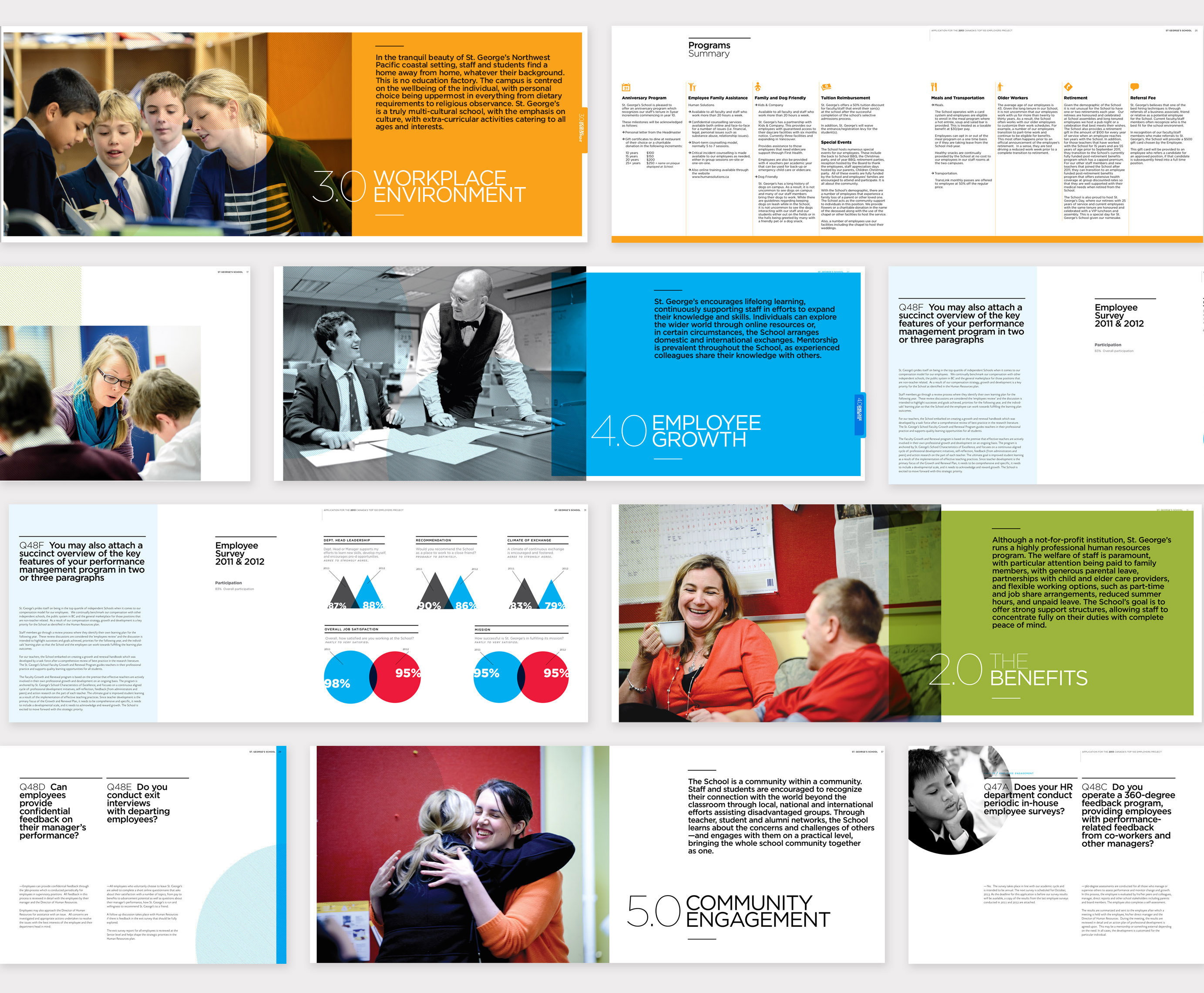
Beyond the initial launch, our partnership with St. George’s continues. Over the years, we have provided ongoing brand strategy and creative direction, shaping everything from admissions campaigns and faculty recruitment materials to wayfinding systems, digital platforms, and athletic branding.
The result? A school brand that feels as timeless as its legacy yet ready for the next century of education.


With over 20 varsity sports and a legacy as one of Canada’s most successful high school athletics programs, the Saints are an integral part of St. George’s identity. As a highly visible extension of the school, the athletics brand needed to reflect the same strength, discipline, and excellence that define its athletes.
Much like the school’s primary identity, the Saints brand had become fragmented, with inconsistent logos, colors, typography, and design elements diluting its presence. We conducted an in-depth audit, identifying gaps and opportunities to create a cohesive, modern identity system that reinforces both school spirit and competitive excellence.
The result is a streamlined, high-impact brand system that balances tradition and modernity, creating a distinct, recognizable identity for athletics, team apparel, facilities, and marketing materials. The new Saints crest embodies the competitive spirit of St. George’s, providing a bold yet refined emblem that represents both the legacy and the future of the program.


Athletics at St. George’s is more than competition—it’s a reflection of honour, discipline, and teamwork. The new Saints identity unifies the program while embodying the strength and integrity of its athletes.
We designed a cohesive, modern brand system centered around a refined crest, a bold symbol of the school’s athletic legacy. Alongside the visual refresh, we crafted a manifesto that defines the Saints’ core values: “We are sportsmen of fine, honourable character. We are defined by selfless courage and integrity. We are competitive and always play fair.”
The result is a timeless yet forward-thinking brand that strengthens school spirit and reinforces St. George’s standing in Canadian high school athletics.


"When we tendered to Persona, we were presented with the potential for a working relationship; a person who would see everything through to the end; a person who spent time understanding the very heart of our soul, someone who was just as passionate about our school as we were."

